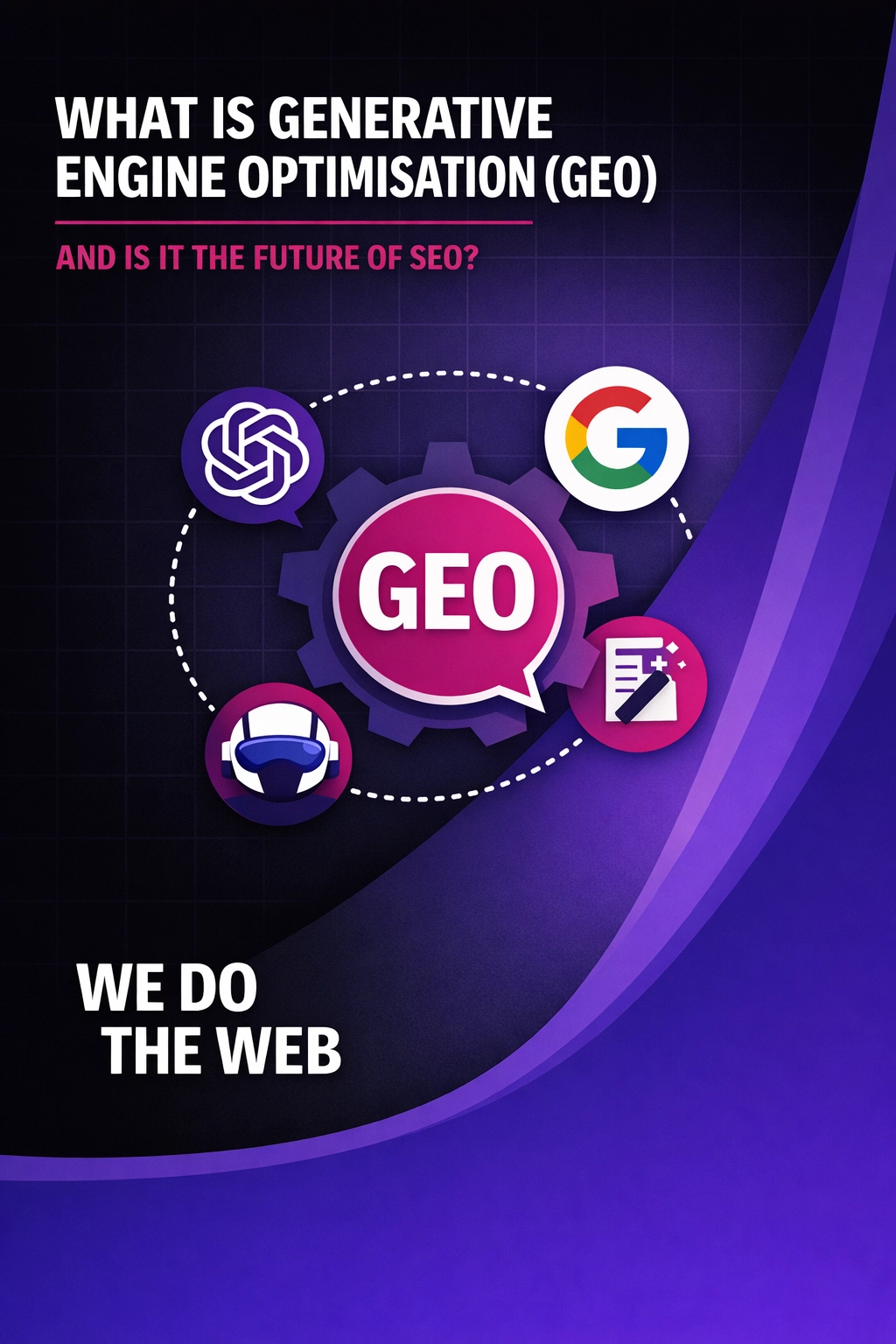
What Is Generative Engine Optimisation (GEO) And Is It The Future of SEO
Generative Engine Optimisation (GEO) is the future of SEO. Learn how AI search is changing visibility and how to optimise your content for AI-driven answers.
Ever landed on a website and felt completely lost like trying to navigate a hedge maze blindfolded? Poor website navigation frustrates users, increases bounce rates, and quietly costs businesses valuable leads.
At We Do The Web Digital Marketing Agency, we see this problem often. Businesses invest in design, content, and traffic generation, yet overlook one critical element: how users actually move through the site. Clear website navigation acts as a guide, helping visitors find what they need quickly, confidently, and without friction which directly impacts engagement and conversions.
Let’s explore why clear website navigation matters, common mistakes to avoid, and how to optimise it for a seamless user experience.
Website navigation is more than a menu at the top of a page. It is the structural backbone of your website and plays a direct role in how users and search engines interact with your content.
When navigation is done well, it delivers:
Clear navigation removes uncertainty and clarity builds trust.
Many businesses unknowingly sabotage their websites with navigation issues that drive users away.
1. Overcomplicated Menus
Too many menu items overwhelm users and create decision paralysis. When everything is important, nothing stands out.
Best practice:
Limit your main navigation to five to seven core categories. Use dropdowns sparingly and only when they add genuine value.
2. Unclear or Creative Labels
Menu labels like “Discover”, “Explore”, or “What We Do” may sound clever, but they often confuse users.
Best practice:
Use clear, familiar labels such as Home, About, Services, Blog, and Contact. Users should never have to guess.
3. Poor Mobile Navigation
With more than half of website traffic coming from mobile devices, desktop-only navigation creates friction and lost opportunities.
Best practice:
Use responsive navigation patterns such as hamburger menus, touch-friendly spacing, and clear tap targets.
4. Missing Search Functionality
When users can’t find what they need quickly, they look for a search bar. If it’s missing, they often leave.
Best practice:
Include a visible search function, ideally with autocomplete to speed up results.
5. Broken Links and Hidden CTAs
Broken links damage trust, while buried calls to action prevent conversions.
Best practice:
Audit links regularly and ensure CTAs are visible, clear, and action-driven for example, “Get a Free Quote” rather than “Submit”.
To build a navigation system that supports both usability and conversions, follow these proven principles.
1. Use a Logical Hierarchy
Structure your website so important pages are reachable within one or two clicks. Users should never feel lost.
2. Implement Sticky Navigation
Sticky menus remain visible as users scroll, making it easier to move between pages without frustration.
3. Include Breadcrumbs
Breadcrumb navigation helps users understand where they are and how they got there especially on larger websites.
4. Optimise for Speed
Navigation elements should load instantly. Slow menus or delayed dropdowns increase abandonment.
5. Test and Refine Regularly
Use tools like heatmaps, session recordings, and analytics to see how users interact with your navigation then refine it based on real behaviour.
A local e-commerce business approached We Do The Web Digital Marketing Agency after noticing high bounce rates and low product engagement.
Challenges
Our Solution
Results
Clear navigation didn’t just improve usability it directly improved revenue.
To explore navigation and usability best practices further, these trusted resources are worth reviewing:
Clear website navigation is not just about aesthetics it is about removing friction, guiding users, and supporting conversions at every step of the journey.
If your website feels like a digital labyrinth, it’s time for a rethink. At We Do The Web Digital Marketing Agency, we specialise in creating intuitive, conversion-focused navigation that helps websites work harder for your business.
Generative Engine Optimisation (GEO) is the future of SEO. Learn how AI search is changing visibility and how to optimise your content for AI-driven answers.

Zero-click search is reshaping SEO in 2026. Discover how AI summaries and instant answers reduce website traffic and how businesses can adapt.
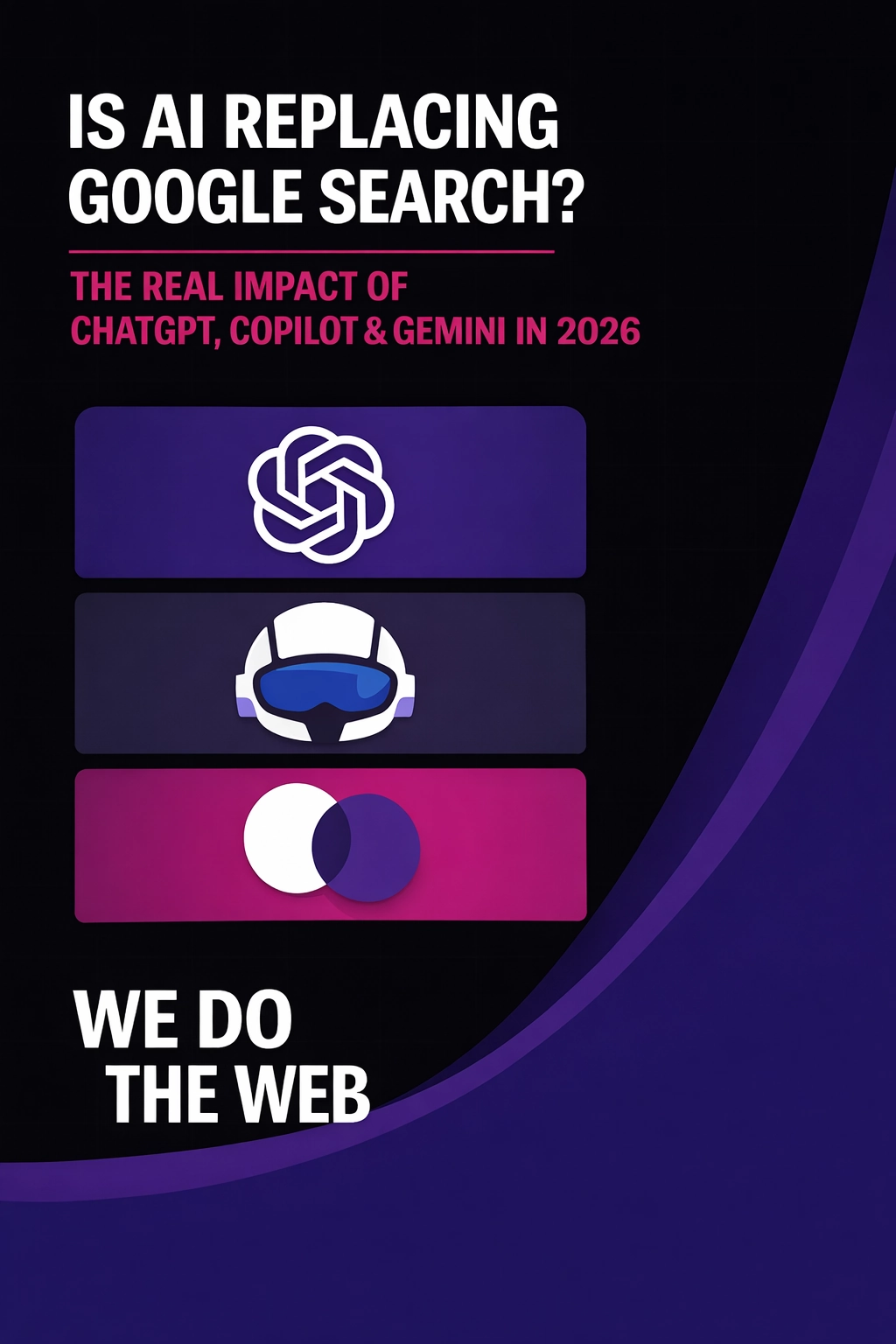
AI vs Google search in 2026: discover how ChatGPT, Copilot, and Gemini are transforming SEO, search behaviour, and website visibility.
It’s simple: they lack user engagement. A well-designed website doesn’t just look good—it guides visitors to take action. At We Do The Web, we create sites that not only attract visitors but keep them clicking, exploring, and converting.
array(1) {
  ["code"]=>
  string(9) "nER9pWg21"
}
Array
(
)
$successArray
Array
(
)